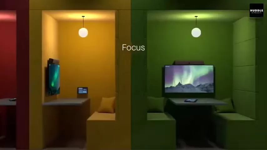
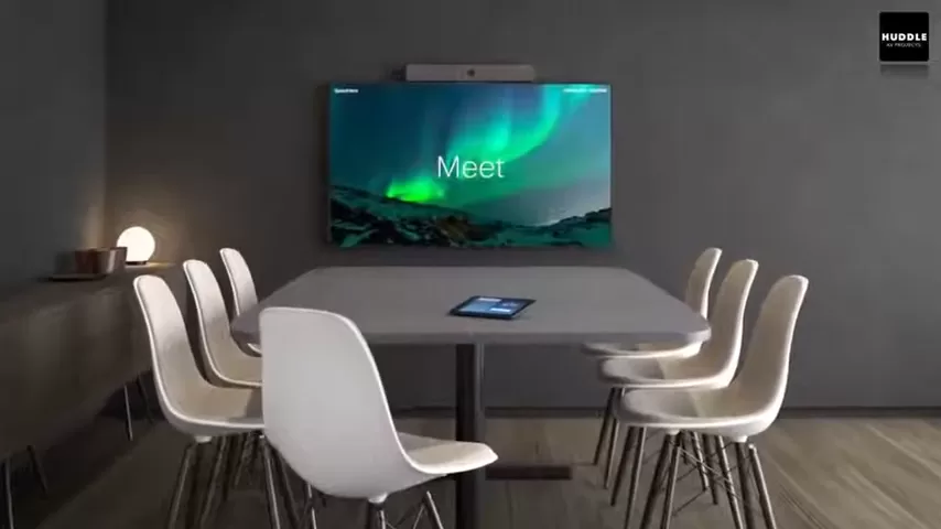
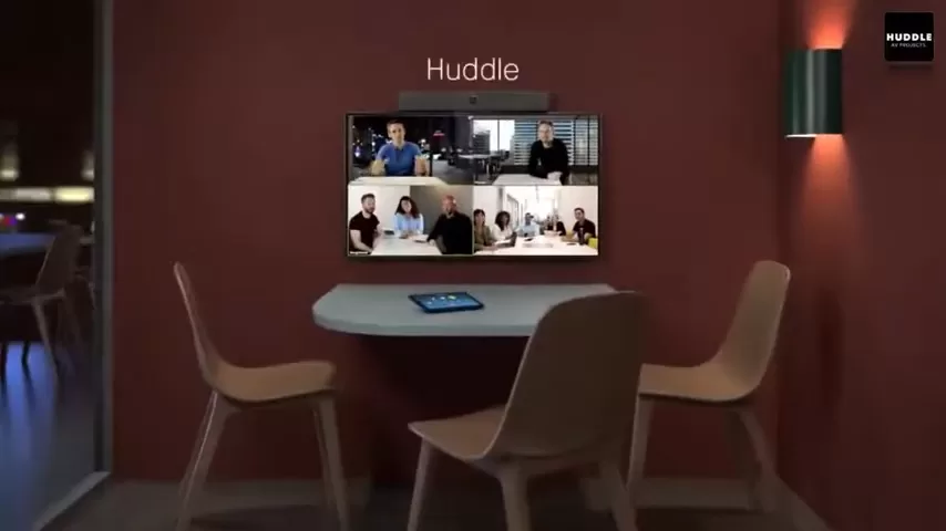
Gallery Wall Layouts for Breakout Spaces and Huddle Rooms
Breakout spaces and huddle rooms are built for quick thinking: a short stand-up, a focused video call, a fast sketch on the whiteboard, then back to work. Because these rooms move quickly, the wall decor has one job: give the space a clear, steady mood without stealing attention from the meeting. A well-planned gallery wall does exactly that. It frames the room, supports your brand style, and turns an empty wall into a useful backdrop for people and cameras.

This guide walks you through planning gallery wall layouts that suit compact rooms and shared work areas. You will learn how to measure the wall, choose a layout that fits the furniture and screens, keep spacing tidy, and install the set with a repeatable method. Along the way, you will see copy-ready layout examples and practical checks that help the wall look balanced from every seat.
Why a gallery wall works in small meeting areas
In breakout spaces, people often sit at different angles, walk in and out, and shift chairs. A single small piece can look lost. A gallery wall solves that by building one larger visual zone, so the room feels finished even when the table is pushed aside or the seating changes. In huddle rooms, the wall behind the table becomes a natural focal area. A clean set of canvas prints can help the room feel organized, which matters when teams are trying to stay on topic.
Another plus is consistency. When the same layout rules are used across several rooms, the workplace feels unified. You do not need matching Office Artwork in every space, but you do want the same planning logic: similar spacing, similar height, and a clear centerline.
Start with the wall, the furniture, and the sightlines
Measure first, then plan
Before you pick any Office Wall Art, measure the wall and note what must stay visible: screens, speaker bars, camera units, outlets, light switches, vents, and markers for wall-mounted boards. These details decide where the gallery wall can live and how wide it can be. Also note the main viewing distance. A huddle room is usually seen from a seated position across a short table, while a breakout wall may be seen while walking past.

A helpful planning step is to mark the “safe rectangle” on the wall: the area where art can sit without crowding doors, screens, or corner trim. This rectangle becomes your layout boundary. Once you have the boundary, you can choose a grid, a staggered layout, or an anchor piece without guessing how much room you truly have.
- Wall width and height: measure the usable area, not the full wall.
- Fixed items: list what you cannot cover or block.
- Furniture footprint: note the width of the table, sofa, or credenza under the wall.
- Camera view: check what shows behind people on calls.
- Lighting direction: note glare from windows or strong ceiling lights.
Pick a centerline that makes sense
Gallery walls look best when they follow one clear alignment idea. In a huddle room, align the set to the midpoint of the table or the midpoint of the main screen. In a breakout space, align to the midpoint of the seating zone. Once you decide the centerline, keep it consistent as you place each piece.

If the room has a strong architectural feature—like a built-in cabinet line or a wall panel seam—use that as your reference line instead. The goal is simple: one steady visual “spine” so the set reads as one planned piece of Office Wall Decor.
Choose a layout type that fits the room
The best layout is the one that feels easy to read from the main seats and simple to install. Use the options below as your starting point, then adjust sizes to match your wall.
- Grid: same sizes in rows and columns for a clean, orderly look.
- Staggered rows: pieces follow a row rhythm, but sizes can change to add motion.
- Anchor plus supporting pieces: one larger canvas print with smaller pieces around it.
- Single-row run: a line of pieces for narrow walls or behind a bench.
- Triptych or multi-panel set: two or three pieces that read as one.
- Two-wall wrap: a small set that turns a corner for compact lounge areas.
Quick picks for common spaces
Huddle rooms: a grid or a triptych keeps the wall calm and reduces visual noise on video calls. Breakout spaces: staggered rows or an anchor layout can bring more energy, especially near lounge seating. If the room is used for frequent calls, avoid placing the busiest piece directly behind the main seat; put it slightly to the side so faces remain the focus.
Size and spacing rules that keep the wall tidy
Match the set to what sits under it
A simple rule: the full gallery wall should be close to the width of the furniture below it. Over a table, aim for a wall set that is wider than the table’s center area but not so wide that it presses into corners and door frames. Over a sofa, keep the set within the sofa width so it feels connected to the seating.
If you are unsure, tape the outline of the full set on the wall first. A few minutes with painter’s tape often prevents hours of re-hanging later.
Keep gaps consistent
Even when your pieces are different sizes, the gaps between them should stay the same. This is what makes the wall look planned rather than random. Decide one gap size and use it everywhere in the set. Many offices start around 2–3 inches between pieces, then adjust slightly based on wall size and how close people sit to the wall.

If you need extra clearance near a screen or board, adjust the outer edge of the full set, not the inner gaps. Consistent inner spacing is what keeps the group readable.
Choose one alignment style
Pick one of these and stick with it: top edges aligned, bottom edges aligned, or centers aligned. In small rooms, top-edge alignment often looks neat because it creates a clear line and helps the set read as one unit of Office Wall Hangings.
Theme and color planning for office wall decor
For office wall decor, the goal is focus, not distraction. Choose one theme per room: landscapes, abstract shapes, animals, or clean graphic concepts. Then repeat two or three colors that already exist in the room through upholstery, rugs, or signage. This keeps the wall from fighting the space. If your brand colors are bold, you can still use them, but keep them as accents inside the artwork rather than turning every piece into a bright block.
If you want a nature feel in a breakout lounge, you can pull pieces from a themed collection and still keep the layout rules tight. For example, a green-forward set from the Jungle Wall Art Canvas Prints collection can fit a casual seating zone while staying office-ready when the spacing and height remain consistent.
Choosing canvas prints for busy work areas
Why canvas prints are a strong fit
Canvas prints work well in shared spaces because they are light enough for many wall types, easy to group into sets, and simple to swap when a room gets updated. A canvas print also reads well from several angles, which helps when chairs move during team sessions. For offices that prefer a clean finish, choosing pieces with consistent edge style across the set can make the wall look more unified.
Size choices for huddle rooms
In a small room, fewer pieces can look cleaner than many small ones. Consider three medium pieces instead of nine small pieces. When you do use many pieces, use a grid so the wall stays easy on the eyes. If you need a starting point for work-friendly styles, browse the Office Wall Art Collection and filter by the mood you want for the room.

When selecting an Office Canvas Print set, keep the subject matter steady within the group. For example, if one piece is very detailed and the others are minimal, the set can feel uneven. A consistent level of detail helps the wall support the room rather than dominate it.
Light and screen checks
To reduce glare near screens, avoid placing pieces directly opposite strong window light. If the room has a screen, keep the nearest canvas print far enough from the screen edge that the wall does not feel crowded. In huddle rooms, it often looks best to place art on the wall beside the screen instead of above it, unless the ceiling height allows generous space.
Installation workflow for teams and facilities
A gallery wall is easiest when you treat it like a small project. Plan it on the floor first, then transfer it to the wall with a repeatable process. If you manage several rooms, save the measurements and a simple diagram so you can recreate the layout later after furniture changes.
- Build the layout on the floor: arrange the pieces and measure the full width and height of the set.
- Mark the wall centerline: use painter’s tape to mark the center and the top edge line.
- Set the first piece: hang the anchor piece or the top middle piece for a grid.
- Work outward: add pieces left and right, keeping gaps the same.
- Step back often: check the wall from the main seats and from the doorway.
- Final check: confirm nothing blocks switches, vents, sensors, or camera view.
Common layout mistakes (and easy fixes)
Hanging too high: If the set feels disconnected from the table or sofa, lower the group slightly so it relates to the furniture zone. In compact rooms, a small height change can make the wall feel grounded.
Uneven spacing: If the wall feels messy, do not move everything at once. Pick one reference line (top edge or centerline), then correct one row or column at a time, using the same gap measurement throughout.

Competing with the screen: If the art crowds the screen, reduce the number of pieces near that edge or shift the full group away. Leaving clear breathing space around screens helps the room feel less packed.
Copy-and-paste layout examples
Small huddle room: three-piece centered set
Place three pieces in a row behind the table, centered to the table midpoint. Keep the bottom edge high enough that chair backs do not overlap the artwork. This layout stays calm on video calls and is quick to install.
Breakout space: anchor plus four supporting pieces
Use one larger piece as the center anchor above lounge seating. Add two smaller pieces on each side. Keep the top edges aligned. This creates a clear focal area without taking over the whole wall.
Narrow wall: single-row run
If the wall is long but not tall, use a single row of four to six pieces. Keep the row centered at eye level from the main path. This works well behind a bench or along a corridor that leads into a meeting zone.
Corner lounge: two-wall wrap
In a small lounge corner, place two pieces on the main wall and one piece on the short wall that turns the corner. Keep the heights aligned so the set reads as one.

Frequently asked questions
1) What height should I use for a gallery wall in a huddle room?
Start by centering the full set around eye level from a seated position, then adjust up if chair backs or a screen edge feel too close.
2) Should the set be centered on the wall or on the table?
In most huddle rooms, center the set on the table or the main screen. In breakout lounges, center it on the seating zone.
3) How much space should be left above a table?
Leave enough space so the art does not feel pressed into the furniture zone. Sit down and confirm the bottom edges feel comfortably above head level.
4) What is the easiest layout for a first-time install?
A simple grid with same-size pieces is the easiest to measure and hang, and it stays neat even if the room is small.
5) Can I mix portrait and landscape pieces?
Yes. Mix them inside a layout rule, such as top-edge alignment or a grid. Keep gaps the same to avoid a scattered look.
6) How do I plan around a wall-mounted screen?
Keep art far enough from the screen edge that both zones feel separate. Many rooms look best with art on the side wall rather than above the screen.
7) How many pieces should a small huddle room have?
Three to five pieces often looks cleaner than a very large set. If you want more pieces, use a grid so the wall stays calm.
8) What spacing should I use between pieces?
Pick one gap size and use it across the full set. Consistent gaps matter more than exact piece sizes.
9) How do I keep the wall from feeling busy on camera?
Use fewer pieces, repeat a limited color range, and keep the layout symmetric. Avoid very small pieces behind the main seat.
10) Should I use one large piece instead of a gallery wall?
If the wall is short, one large canvas print can be a good choice. If the wall is wide, a gallery wall can fill the space more evenly.
11) What layout works best above a sofa in a breakout area?
Try an anchor piece with smaller pieces around it, or a centered row of three to five pieces, sized to stay within the sofa width.
12) How do I keep the set level without special tools?
Use painter’s tape to create a straight reference line, measure from it, and step back often. Small checks prevent drift.
13) Can I expand a gallery wall later?
Yes. Choose a layout style that can grow, such as staggered rows. Save your measurements so new pieces follow the same gaps and height.
14) What should I do if the wall has vents or switches?
Plan the outer edge of the set so fixed items stay clear. Keep inner spacing consistent and adjust only the border of the full set.
15) How do I decide on a theme for different rooms?
Use calm themes for rooms that host focused meetings and stronger themes for casual areas. Keep the theme consistent within each room so the wall reads as one idea.


